|
|
|
|
|
|
 |
« Reply #197 on: February 14, 2012, 04:18:39 AM » |
|
Pimp Geno and Classic Geno XP I think that for the classic Geno, maybe there could be some highlights on the shoes? I fear it may look a little too flat otherwise, especially compared to all the other more detailed recolours
|
|
|
|
|
 Logged
|
|
|
|
|
|
|
|
« Reply #198 on: February 15, 2012, 01:10:47 AM » |
|
StarWaffle, all those recolors are [censored]ing epic man. Wow.
|
|
|
|
|
Logged
|
|
|
|
|
|
|
|
« Reply #199 on: February 15, 2012, 05:29:19 AM » |
|
texture i made out of KTH´s texture and pik´s vertex:  the same colour of the cape/hat as Pik´s vertex and KTH´s texture on the head/eyes/body Blue feels way too dark :< |
|
|
|
|
Logged
|
|
|
|
|
|
|
|
« Reply #200 on: February 15, 2012, 05:41:13 AM » |
|
Blue feels way too dark :<
You do realise that this probably isn't even going to be used right? MarioDK will probably use StarWaffle's textures. |
|
|
|
|
Logged
|
|
|
|
|
|
|
|
« Reply #201 on: February 15, 2012, 08:12:26 AM » |
|
You do realise that this probably isn't even going to be used right? MarioDK will probably use StarWaffle's textures.
Well I'm glad to hear that, I prefer those actually. Why was that texture made, testing purposes? Boredom? |
|
|
|
|
Logged
|
|
|
|
|
|
|
|
« Reply #202 on: February 15, 2012, 08:48:23 AM » |
|
Well I'm glad to hear that, I prefer those actually.
Why was that texture made, testing purposes? Boredom?
Because they needed a better texture. KTH made that before Star made his. |
|
|
|
|
Logged
|
|
|
|
|
|
|
|
« Reply #203 on: February 15, 2012, 10:10:36 AM » |
|
Speaking of recolors, here are the last 2 slots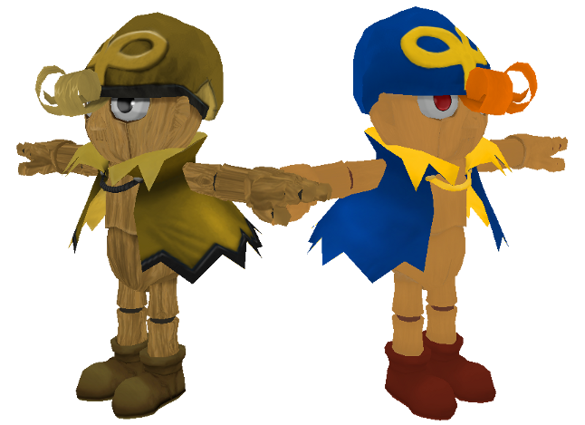 Too flat? Use Cell-shading. Why not? Anyways, this all looks awesome. Can't wait! |
|
|
|
|
Logged
|
|
|
|
|
|
|
|
« Reply #204 on: February 15, 2012, 12:01:37 PM » |
|
 the animation is still needs alittle more work but almost done just the rig on the canon i need to fix at the feets but i do that before i release beta version of this psa to some ppl |
|
|
|
|
Logged
|
I Dont Take Requests & Dont Do Brawl Mods anymore Maybe Sm4sh modz later
|
|
|
|
|
|
|
« Reply #205 on: February 15, 2012, 12:19:19 PM » |
|
Because they needed a better texture. KTH made that before Star made his.
Okay, got it :3 the animation is still needs alittle more work but almost done just the rig on the canon i need to fix at the feets but i do that before i release beta version of this psa to some ppl This.. this is beautiful, and yeah you're right about the feet. Very well done. |
|
|
|
|
Logged
|
|
|
|
|
|
|
|
« Reply #206 on: February 15, 2012, 12:38:25 PM » |
|
the animation is still needs alittle more work but almost done just the rig on the canon i need to fix at the feets but i do that before i release beta version of this psa to some ppl |
|
|
|
|
Logged
|
|
|
|
|
|
|
|
« Reply #207 on: February 15, 2012, 01:02:35 PM » |
|
The animation is ... kinda weird, and SDo0m say everything that need to be said
But it look really promising ! ... When are we going to have In Game screen ? *can't wait*
|
|
|
|
|
Logged
|
|
|
|
|
|
|
|
« Reply #208 on: February 15, 2012, 01:05:23 PM » |
|
I think it's good exept for the feets of course  |
|
|
|
|
Logged
|
|
|
|
|
|
|
|
« Reply #209 on: February 15, 2012, 01:15:31 PM » |
|
Looking great so far. I agree that maybe making it a bit more cartoonish would help its cause, but no need to rush it.
|
|
|
|
|
Logged
|
|
|
|
|
|


 Poll
Poll


