|
|
 |
« Reply #1410 on: February 12, 2012, 05:52:49 PM » |
|
Personally, I love the fact that he's really shiny. I think he should be as shiny as he is now, but the shine is just shaped better to fit Metal's structure. For example, the shine on the head and body could be more rounded. Like a mix of the two spoiler pics
|
|
|
|
|
 Logged
|
|
|
|
|
|
|
|
« Reply #1411 on: February 12, 2012, 07:24:13 PM » |
|
Vote time!! (these use ItalianStallion's texture) 1) 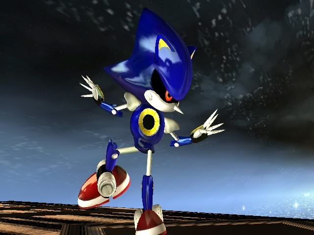 2) 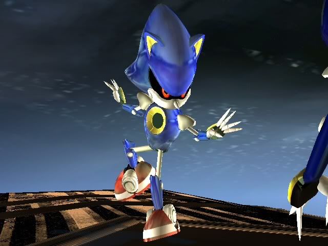 3) 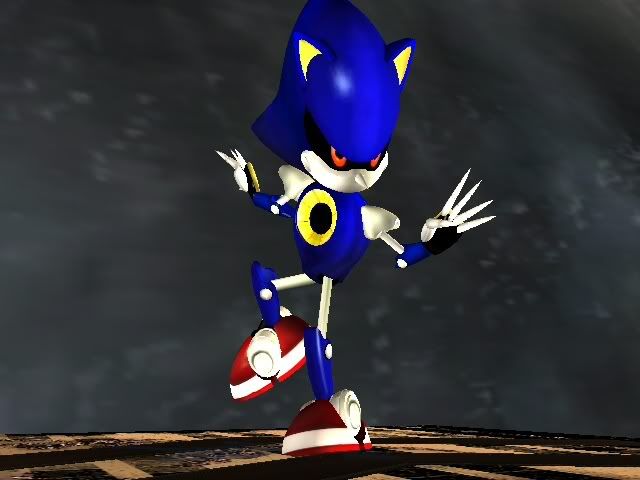 4)  Groups (in order, 1 is on far left, 4 is on far right) 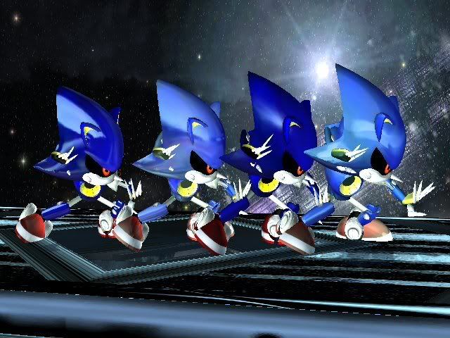 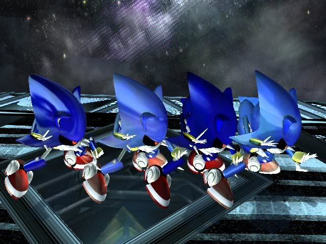 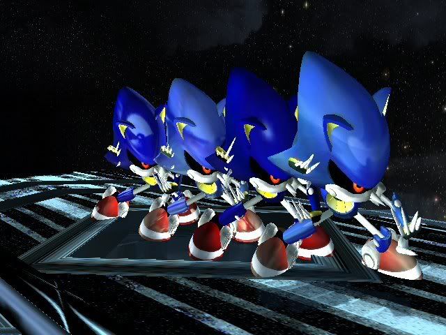 Back (4 on left, 1 on right) 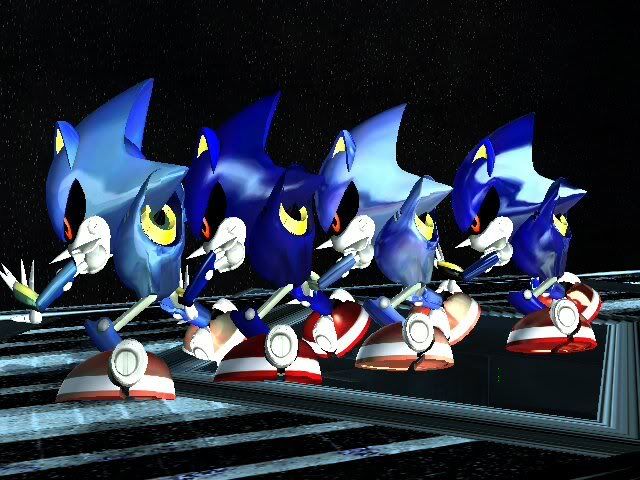 |
|
|
|
« Last Edit: February 12, 2012, 07:35:52 PM by Nanobuds »
|
Logged
|
|
|
|
|
|
|
|
« Reply #1412 on: February 12, 2012, 07:33:16 PM » |
|
i choose 1  |
|
|
|
|
Logged
|
|
|
|
|
|
|
|
« Reply #1413 on: February 12, 2012, 07:33:52 PM » |
|
I choose 1 or 4
|
|
|
|
|
Logged
|
Quotes: Not all people have the luxury of being able to buy things whenever they want.
Some people are barely scraping by in the economy.
Modding has made you guys so spoiled.
|
|
|
|
|
|
|
« Reply #1414 on: February 12, 2012, 07:34:05 PM » |
|
#4 gets my vote! i like its shine effect the best except the texture of Metal Sonic itself look a lil too "white" i like the blue and red from the one next to the white one from this dude's textures |
|
|
|
« Last Edit: February 12, 2012, 07:34:57 PM by ramonM64 »
|
Logged
|
|
|
|
|
|
|
|
« Reply #1415 on: February 12, 2012, 07:35:24 PM » |
|
They are all the HD texture in the pack, so their textures are the same
|
|
|
|
|
Logged
|
|
|
|
|
|
|
|
« Reply #1416 on: February 12, 2012, 07:39:39 PM » |
|
Man.
1 is so sexy.
Gonna go with that.
|
|
|
|
|
Logged
|
|
|
|
|
|
|
|
« Reply #1417 on: February 12, 2012, 07:44:53 PM » |
|
Am I the only one that found 2 to be the best? Are you gonna release all versions or is voting for the one that gets released? I hope you release all version XD
|
|
|
|
|
Logged
|
Friend Safari: Bug (Masquerain, Butterfree, Pinsir)
4613-8365-7114
|
|
|
|
|
|
|
« Reply #1418 on: February 12, 2012, 07:45:33 PM » |
|
It depends... I may just include the Ref textures, and have people put them in manually.
|
|
|
|
|
Logged
|
|
|
|
|
|
|
|
« Reply #1419 on: February 12, 2012, 07:47:17 PM » |
|
i think #1 is the unedited one, that one half-sphere can be seen on the head at some angles.
if there was a way to combine the blueness and redness of the 1st to the 4th's shine effect, my vote would go there.. they all look siiick though
|
|
|
|
|
Logged
|
|
|
|
|
|
|
|
« Reply #1420 on: February 12, 2012, 07:52:26 PM » |
|
I'm gonna say 2. It just needs a brighter blue texture  |
|
|
|
|
Logged
|
|
|
|
|
|
|
|
« Reply #1421 on: February 12, 2012, 07:54:49 PM » |
|
I just think #4 needs to be a bit darker... I'll test it out now I'm gonna say 2. It just needs a brighter blue texture Its the shine effect that makes it appear bright. The texture wont really affect it... I'm gonna test 2 more shine textures, ill be back with pics soon and yes... #1 is the unedited |
|
|
|
|
Logged
|
|
|
|
|
|
|
|
« Reply #1422 on: February 12, 2012, 08:16:13 PM » |
|
First to submit my vote! Honestly, I like the first image better...Looks higher quality and the contrast between the metal and shine is greater, which makes it more realistic.
|
|
|
|
|
Logged
|
Mostly a Sonic guy. In fact, ive been a Sonic fan since...I dunno, forever?  Now how the heck can you post pictures on your Signature? Personas : Jet the Hawk Tails (Sonic Free Riders style) |
|
|
|
|
|
|
« Reply #1423 on: February 12, 2012, 08:16:34 PM » |
|
its down to these two 1) 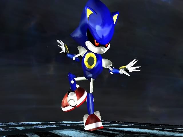  2)   1 on left, 2 on right  2 on left, 1 on right  |
|
|
|
|
Logged
|
|
|
|
|
|
|
|
« Reply #1424 on: February 12, 2012, 08:19:43 PM » |
|
THERE!
thats it right there. you found the perfect balance from the past #1 and #4. my vote went there.. for the new #1.
|
|
|
|
« Last Edit: February 12, 2012, 08:22:27 PM by ramonM64 »
|
Logged
|
|
|
|
|
|